Tuesday, 20 May 2014

More Backgrounds and Starting to Animate Scene 1


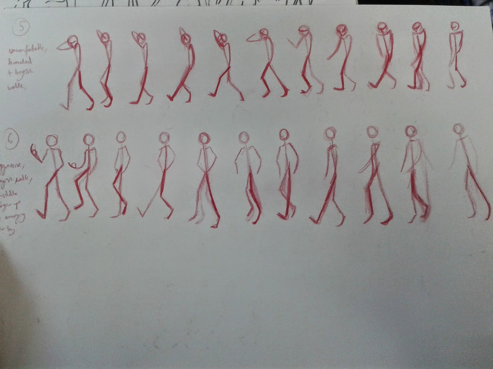
With animating, I started off doing a few sketches of how I imagined the skeletons moving through a walk cycle for different characters. I had to think about the attitude and personalities of the characters in how they walked as the walk cycle's purpose was meant to show how different they all are.


So after I had taken photos of these sketches, I put them in the background of a flash document as a guideline for each character. I drew the skeletons as a first layer.

Then, I went over the skeletons in a layer of colour that suited each character. For example, a pink for what we would consider the most feminine and a dark green for what we could consider the most masculine character. As well as this, I drew each character their own body shape. These shapes were the most imporant in the story to again focus on the character's diverse appearance and how it is impossible for one body type to represent all of them.


After the shapes, I went over in black lines to hint to some more of the characters' features. The clothes were important to some. For example, a boyish hat, baggy jeans and tank top were necessary to hint to the transgender man. He is one character I thought was necessary to include and present in this story due to having to run away from a strong and toxicly gripping identity that many people born with a Y chromosome are just expected to fit in to. 


After animating the walk cycle I decided to put in the background. A watercolour wash of pastel sunset colours I felt were necessary to hint to reality but still the very present features of femininity which linger round the characters in their awkward and un-enlightened day to day life. 


I wanted to add something to the city scape instead of simple but bold blocks of colour so found a nice brush on photoshop to customise simple block shapes I made on MSPaint, a simple but reliable program. 


From this I made copies over and over by each other and put them together as a PNG before adding the to the background on Flash. I made the city scape move along side the characters and their different paces of walking.


A scene consisted of the background zooming in and changing colour as it does, so I edited the background on photoshop to get the colours right for the next part of the animation.


I was happy how this process went and intend to try and animate in the same way with the next scenes. The simple watercolour backgrounds were not too chaotic to do and also I felt very happy with their fluid looking outcomes. 

Monday, 5 May 2014

The Meaning of the Story

After talking over with a few tutors what my story was about, I felt like the way I was explaining it wasn't being understood the way I saw it or the way I was explaining it wasn't coming out how I needed to tell the story that was still quite roughly put together. Through answering questions about what the story was actually trying to say, I finally asked myself.

Unlike, the body positive movement that focuses on different women of different shapes, sizes and backgrounds, smiling and enjoying their bodies in a Dove advert, there isn't really an obvious explanation for why this happiness with in themselves is a big deal. Why is it special that they are happy? I don't want to make this about self love. I want it to be about fighting against self hate. Self hate is way too easy to fall in to and be dominated and taken over by. That's what the monstrous 'perfect woman' I feel truly represents. At first it was all about not letting outside sources stop you from loving and appreciating all you are. Not letting outside sources change who you are. But at the end of the day, if you are overweight and feel physically unhealthy but don't want to change, in fear of losing a battle against the beauty industry, it can end up with you sacrificing your physical health to try and look for happiness in your mental health.
It may not be exactly the same, but if there is help out there for a disabled person to perhaps learn how to walk again, loving the body they have to refuse improvement in their physical being isn't something I'd see as healthy.

The other day I had quite a negative anonymous message, commenting on what I post on on my personal Tumblr blog. It seemed to bring out a response from me which I think worked with what I was saying in my film:
You do know it can be really and mean REALLY unhealthy to be the size of some of the girls you reblog, I 
get you can be any shape you want and look beautiful and all that but its not healthy after a certain extent and I dont think it should be promoted...
I reblog a lot of images of different sized girls. If you're referring to the larger ladies then:
Go tell this to the whole fashion industry. Whilst we can accept girls slimming down, we'll only get worried 
when we can see a bit of rib and then we'll be concerned when it's usually too late. 
Four of my friends had eating disorders. Three of them we only noticed until it was time for them to go to
 hospital. That's sickening to think about. One of them we didn't even realise because she she wasn't stick thin and that's terrible.
When it's a fat girl's health we're talking about, not only do we see it as unhealthier than a girl starving herself and going through mental fuck ups to be what the world considers is 'perfect' (it doesn't purely revolve around that but is one factor for many cases of eating disorders) but she isn't even shown concern. 
Quite the opposite, fat girls are hurtled with discouraging words of hate.
I don't reblog these images of girls cos i think they are perfect. none of the girls thin/curvy/fat i think are
 perfect. I don't know these girls. don't know how their body works. For some of them their metabolism may
 work that way and in fact they are physically healthy but their fat is distributed a different way from the 
women we're used to seeing. Perhaps she is physically unhealthy and could cut down on some foods or 
exercise more. 
Again, I DON'T KNOW THEM. 
I'm not promoting anything. I like what I see and reblog what I like.
What see are girls who at that moment in time don't feel hateful of themselves. self hate is one of the most
 dangerous things someone can experience. You have so much power over yourself, you can use that to a
 terrible extent.
When people hate themselves they destroy themselves. Do you think picking on someone for being fat is
 going to motivate them? In a number of cases they will wither away and eat for comfort, destroying
 themselves even more. You NEED to let someone make healthy choices for their body on their own terms.
 Guidance is helpful but judgement is toxic. 
Go send your anon concerns to a pro- anorexia blog or a fat fetish blog where women's bodies 
are promoted completely unhealthily and for the wrong reasons. They need it more than do...

Another issue I faced with the meaning of the story was when I was asked, 'why have the disabled person in at all? With something like that, it seems that a strong issue like this can take over the story' and I agreed to this point. I was wondering if I needed to stick to the body image theme more than these other issues such as race, age, disability and identity. However, I realised that I wanted to do so much more than the repetitive 'this pear shape girl feels unworthy cos she's not hourglass'. This has been done before and I really think that self hate over your appearance is more complicated than 'oh no I'm fat'.

Animatic and Background Colour Palettes


So far I have collected a few colour palettes for background ideas.
I wanted the 'real world' to consist of subtle girly colours. Subtle enough to be seen as part of a natural, beautiful sunset but still the pinks and lilacs hint to the quite un-natural, manufactured pretty things that are created by ourselves. 

In the deep pit of our minds shows the attractive but dark and toxic colours that can drown us in to thinking we as we are there and then aren't good enough. I wanted the colours to look rather un-natural yet very inviting. Pink and purple I thought were important as the main colours, as they're stereotypically feminine.

After some people get out of world in their minds, the real world, I plan on changing to less feminine and more gender neutral yet decoratively appealing colours. I also wanted it to be warmer and more natural, hence the greeny blues and oranges. 

As well as that, I've put together an animatic of what I pretty much plan on animating. There are parts I see as not entirely necessary but I plan on working on the strong, needed parts to explain the meaning of the story. 

Friday, 2 May 2014

Starting to Animate


When it came to animating, I started to think realistically how much am I going to get done in the time I have left of this project. With that in mind, I looked for examples of animation that use very simple shapes of colour to summarise the image of the characters bodies. A short french animation called 'Suzy's Willy' was a good example I found on the 'Animade' blog. 


I liked the simple use of shape and small detail in fine lines around the characters. I think what is good about this simple design for the characters is the fact I can exaggerate the shape of each person (which is what's quite important for the story). 


Final Character Designs and Storyboards


I was thinking over how the story of my animation could be less of a small summary of different people's lives and show more of a specific perspective through a person's experiences. From this, I looked back at an article from my mass collection of research and saw how the story could also apply to my own meaningful experiences. The article was titled 'Hollywood's Invisible Love Interest: the Overweight Black Woman' and it talked about how the most influential, powerful, film industry in the world was missing out a character which so many women would feel so happy to see presented in films. One of these women are myself and the reality feels like I either have to be slim and light skinned (me, being mixed race and lighter than some coloured women I am aware of is quite a privilege) or a sassy, dark, obese woman with sassy attitude and even then I'd be seen as a joke and not a human being. 
At first I did a rough storyboard of my perspective through a character I had designed. I wanted her to look quite feminine and girly yet desireable without too much of a sexy flair. I gave her quite short, afro hair and designed her curves and fat so that they were visible in, usually seen as quite unfortunate, areas but her posture in a pair of heels and confidence at the start of her walk made her look like a person we want to know about.

Sketches of different afro hair

Possible character designs


The story I came up with for this woman was quite long and although it was quite personal, I thought that I was missing out on what needed to be done and have it accomplished short and sweet.
I went back to my original story idea but thought the character that could apply most to me was the best to make as the main character.


Again, The final story I imagine I should work on specific parts in case all of it I can't do. I won't completely take them out of the story though, seeing as they are quite important.


Thursday, 24 April 2014

Animation Style Ideas


The first animation style I had in mind was to take advice from Tom Bancroft in his book 'Creating Characters with Personality'. This was not because I saw it as reliable. In fact quite the opposite. 
The above image basically summarises the whole book. The whole book explains and presents images of how to create male characters with personality and when it comes to designing women characters there's only one chapter dedicated to it and even then it's only for them to be conventionally attractive for the purpose of being the love interest in your story. I wanted to create quite a negative message around this 'perfect' woman character and intend to design her around this chapter.


The short animation 'This Actually Happens A Lot' by Tom Laww I liked the look of due to it's simple coloured backgrounds but with a use of detailed lines for walls and furniture. Cos to some extent I wanted to not clutter the background but still draw in some detail.


I liked the look of the short animation 'Suzy's Willy' by Xavier Sailliol and Loic Espuche. It's simple block colours for the shape of the bodies yet the detail of the faces was pleasantly simplistic and I think exaggerated features that I hope to also present.


The animated feature film 'Cats Don't Dance' I thought all in all was important in relation to my project as it is about the invisibility of animals in the film industry. The animals in this film walk and talk and live like any other person yet they are not taken as seriously as humans and therefore keep getting the roles as extras if anything. I felt that it related to the invisible women that are pushed away from the roles of the 90210 cast and even in films, such as the Avengers and Frozen, that feature an empowering, strong, independent female role are still conventionally attractive. It's almost an insulting idea that her appearance not being a problem would be a bit too much for the public to handle. 

In one of the scenes in 'Cats Don't Dance' the popular human actress, Darla Dimple, sings about sabotaging the animals' performance to one of the big Hollywood directors. In this we see her as a giant towering over the main characters who she floods in a pink whirl pool and sends them down a waterfall. I like how it is all very feminine to show the evil side of her innocent little girly image and the water is used as a very oppressive and suffocating force. 

I'm hoping to use a similar idea of pretty and attractive visuals that force a negative and dangerous situation on the main characters.

I realised that not only did finding different animations really help to get an idea of what designs I could use but the expanded my ideas behind the story. Next time, I intend to develop these ideas in to more focused visuals from out of my head and on to paper.

Character and Story Ideas


From the interviews with friends and secondary research looking in to the invisible groups not valued for their unconventional beauty I decided to create some character designs around the different people. I'm not quite sure whether I want to stick with these designs or change them in order to try and portray the right messages but am determined to develop the ideas around them to help my decision. 

I finally came up with a storyboard. It is a first draft, so consist of more than I'll end up doing but again I will try to develop the characters' thus developing the story around them. 
As for the song, I have broken it down from 7 minutes to 3. This is mainly due to the length of the lyrics. In the end, I could just cut the lyrics out altogether and be able to shorten it further so there's not too much of a problem. 

I've done a few sketches around what the intro to the film can be. I plan on doing a short walk cycle of each character, displaying something they feel about themselves in their bodies, as well as transforming in to each other. I felt this transformation could show the diversity of the characters as well as how different they are, thus showing one of the mian messages of the story that there will never be just one natural body. One of the bad messages which areas of the body positive movement try to advertise is the idea of 'real women' and what a 'real' body looks like. Usually this points straight to a size 14/16 woman which may be seen as the average size but that doesn't mean it is the right nor is it the only truly healthy or beautiful size for everyone. 

Next week will be dedicated to finalising storyboards, character designs, backgrounds, colour palettes and animatics. So far, I have written up a few timetables to point me in the right direction and have collected together a few ideas from animations, artists, images and photography of what I want my work to hopefully follow.